Designing to inform: a transmedia campaign for a design conference.
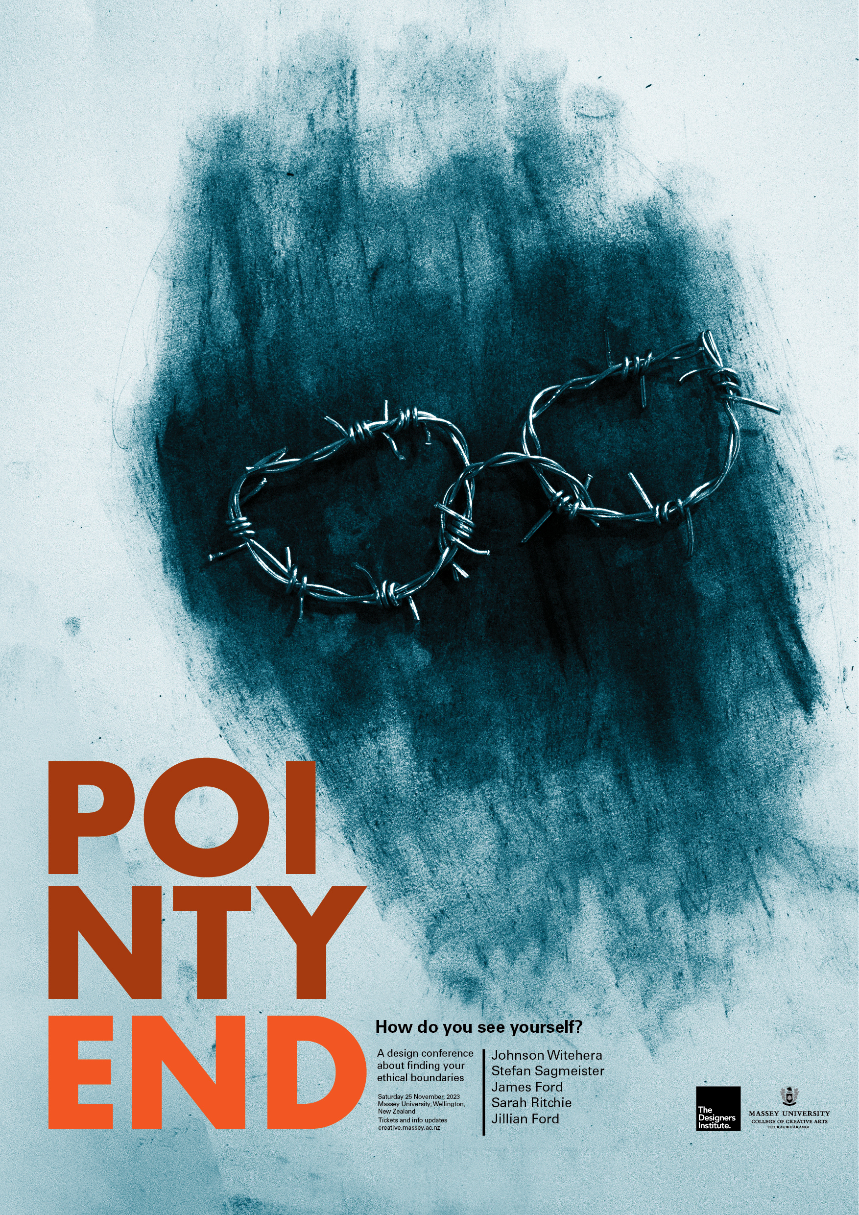
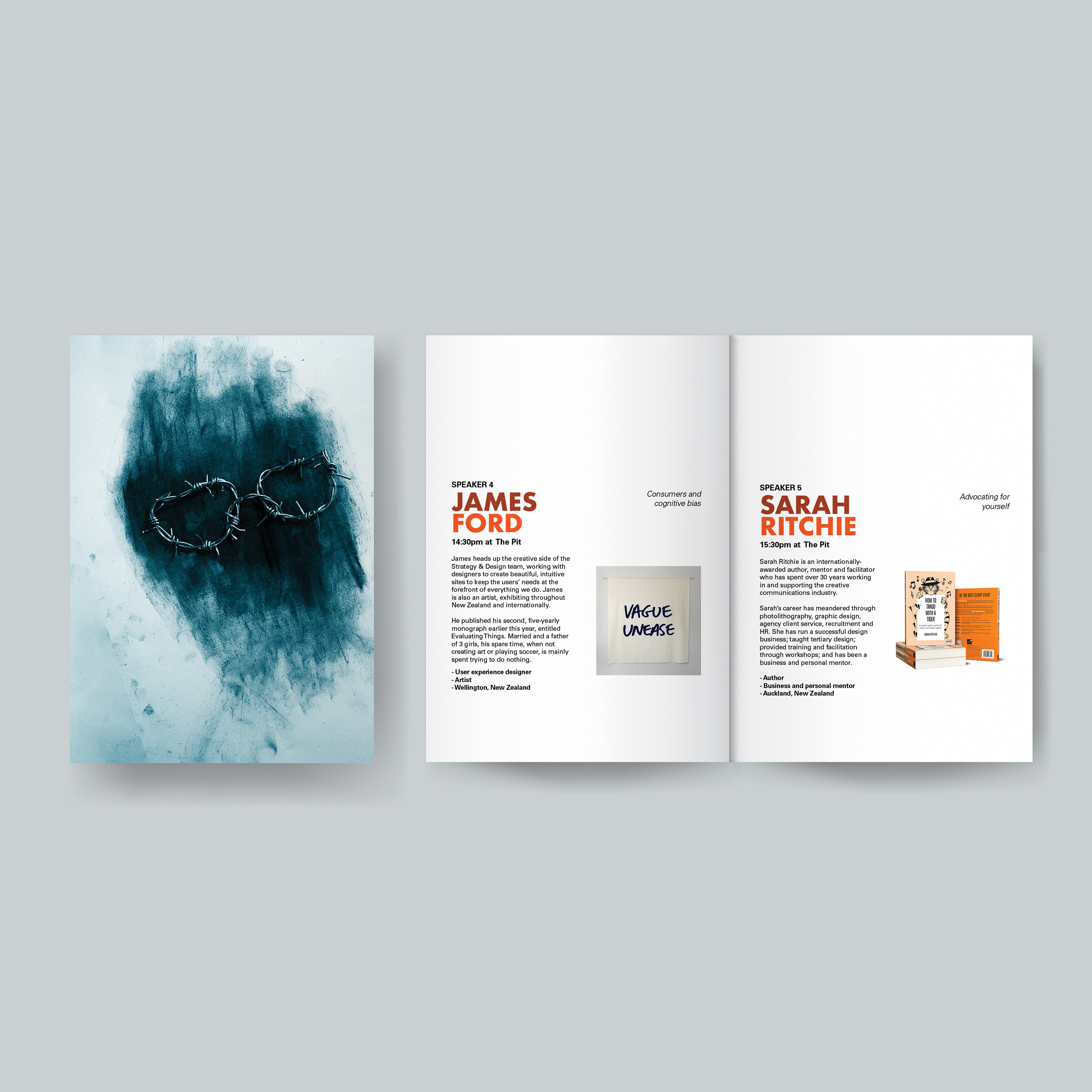
This conference informs about the ethical decisions a designer must face whilst, in the industry. There are three main components of the visual style that inform how it is read. Firstly, the rhetoric is barbed wire shaped into different objects. To help emphasise this, there are tag lines on the poster, creating an effective text-to-imagery relationship. For the glasses, it reads “How do you see yourself?”, and for the shoes, it reads “Can you walk the talk?”. The barbed wire glasses highlight the ethical boundaries you see yourself dealing with, and the barbed wire shoes imply a difficult and painful experience of “walking the talk”, which similarly shows a struggle with boundaries. Furthermore, barbed wire was chosen as it is sharp, and is associated with darker, more visceral themes, which implies that the conference will have a serious approach. Secondly, there are charcoal smudges used throughout all of the imagery. This is to link back to the design focus of the conference to create an artistic, and handmade feel. The charcoal smudges are also very untidy - this emphasises how ethical boundaries can be unclear; it is difficult to see the fine line. Lastly, the colours of blue and orange work to juxtapose this darker atmosphere to create a hopeful, but pensive feeling. All in all, the visual rhetoric creates a bold but honest approach to finding your ethical boundaries.

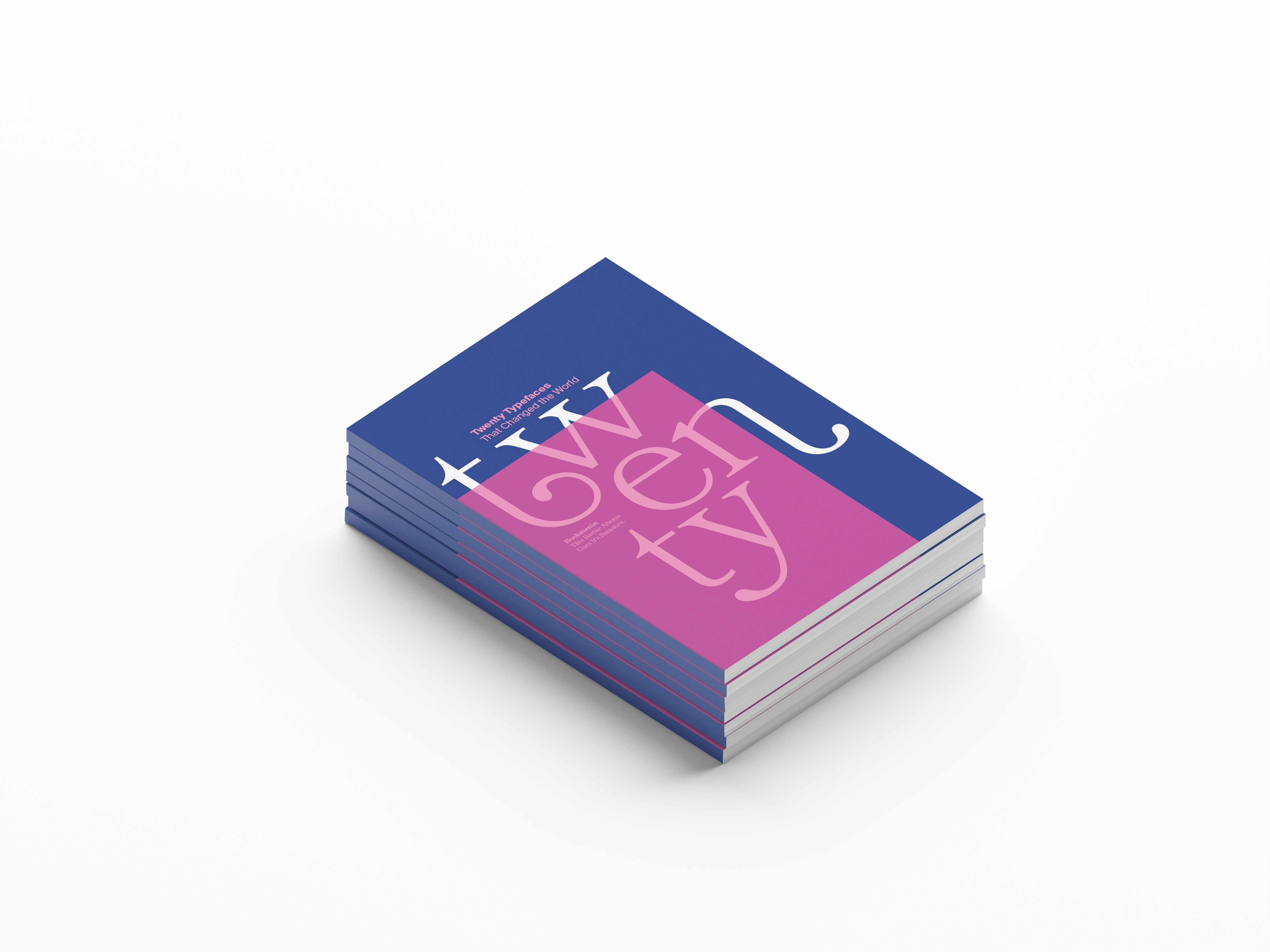
The pamphlet made to accompany the conference
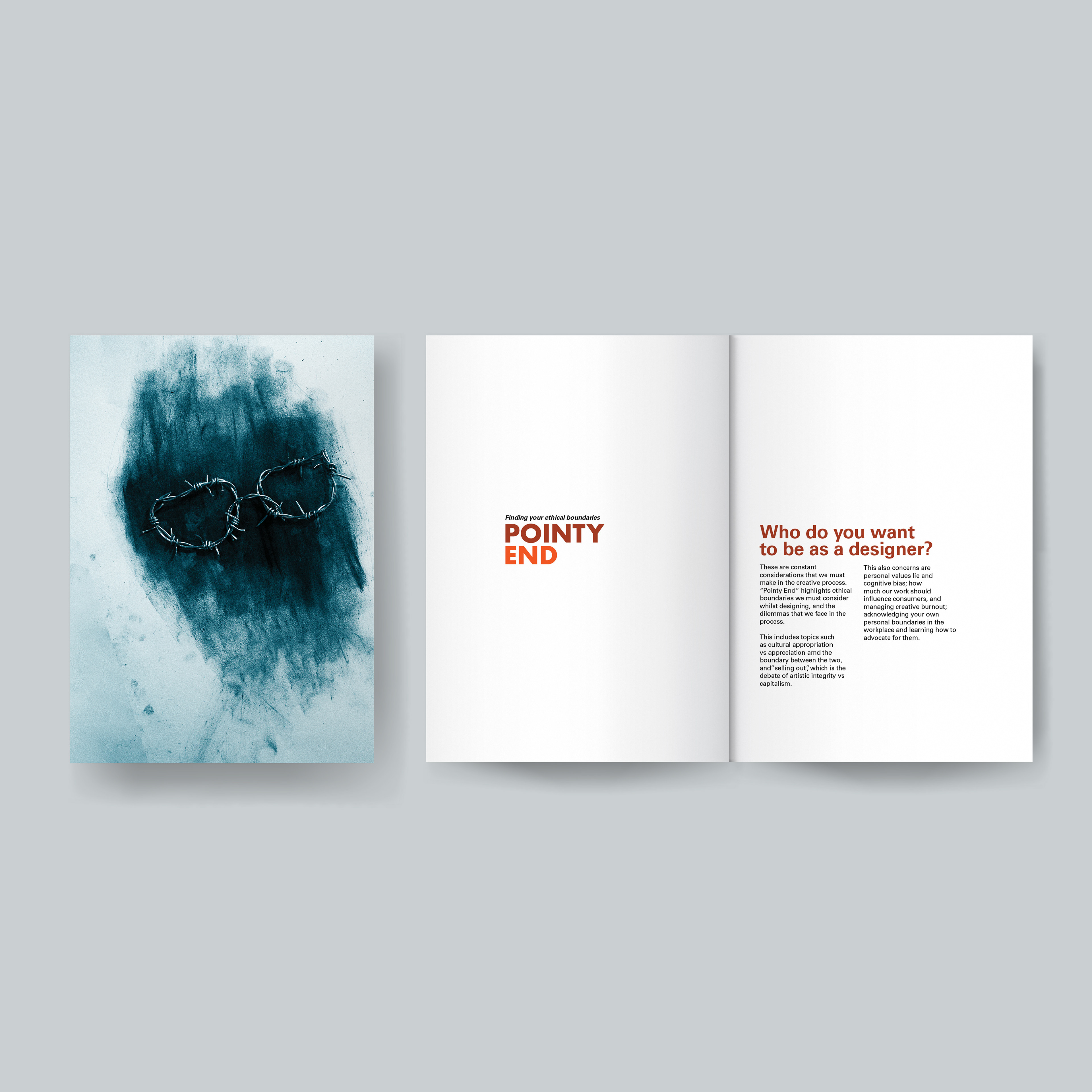
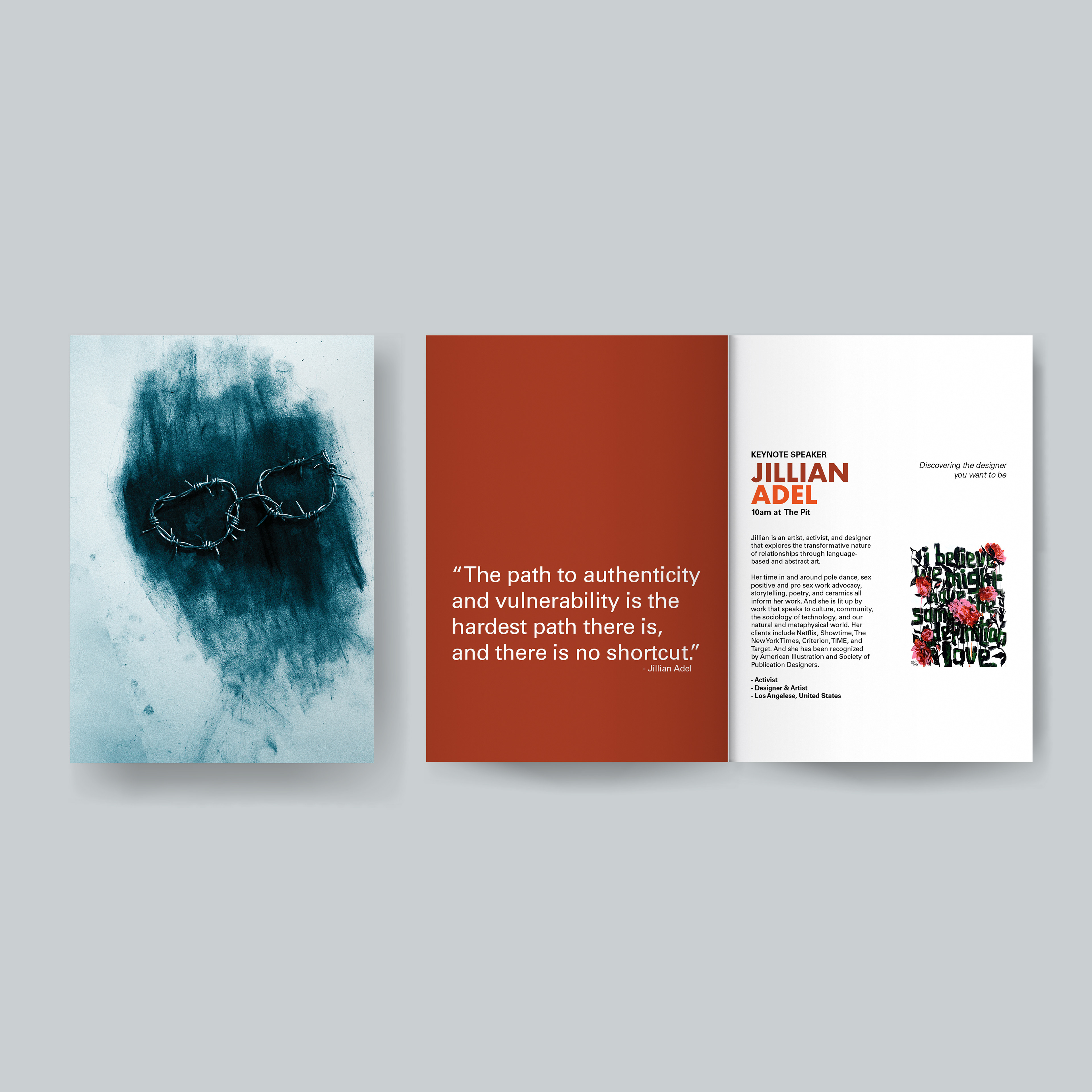
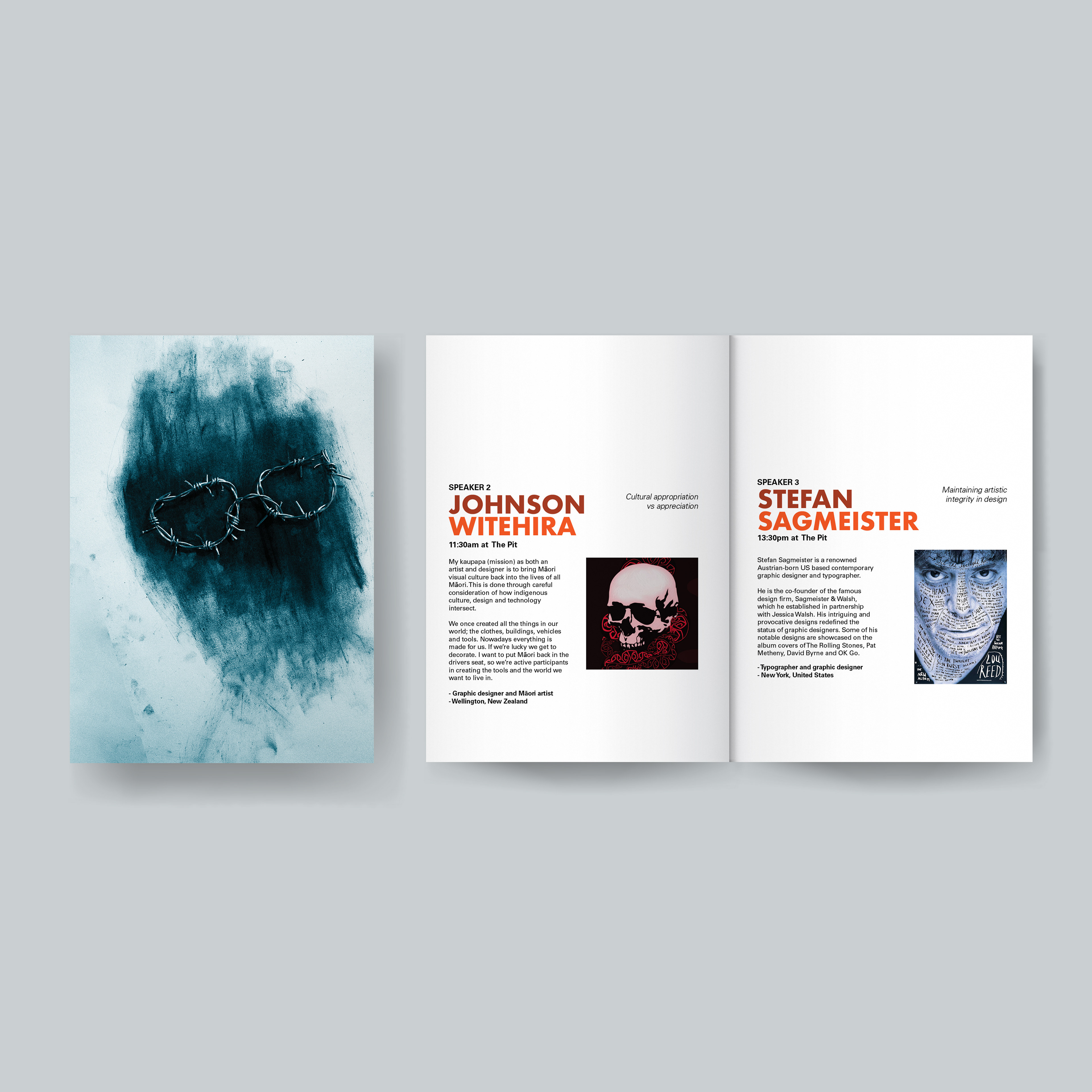

Pamphlet mockup by rawpixel.com on Freepik
Experience design - some animations to be shown around campus.
